
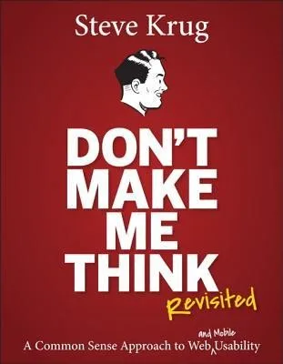
Key ideas
- The overriding rule of usability is "don't make me think": a page should be self-evident, so a user never has to stop and puzzle out what something is or how to use it.
- People do not read pages, they scan them; they do not choose the best option, they pick the first reasonable one; and they do not figure out how things work, they muddle through.
- Design for scanning: use conventions, a clear visual hierarchy, obvious clickability, and short scannable text, so users can find what they need without effort.
- The number of clicks matters far less than how hard each click is; unlimited mindless, unambiguous clicks beat a few confusing ones.
- Stop arguing about what users like and just test, because a cheap, informal usability test with a few people settles debates that opinion never will.
- Every user arrives with a reservoir of goodwill, and thoughtless design drains it while small courtesies refill it.
If something requires a large investment of thought, or looks like it will, people are less likely to use it; your job is to make the obvious obvious.
Mental models
- Krug's first law: Don't make me think — A page or screen should be self-explanatory, so that a glance tells the user what it is and how to use it. Every ambiguity, unclear label, non-obvious button, or unexpected behavior generates a tiny "question mark" in the user's head, and those question marks accumulate into cognitive load that makes the product feel hard. The goal is to remove them, so using the product requires as little conscious thought as possible.
- Scanning, satisficing, muddling through — Three facts about real behavior. People scan pages for the first thing that looks relevant rather than reading thoroughly. They satisfice, choosing the first option that seems good enough instead of weighing all options for the best. And they muddle through, forming a rough, often wrong idea of how something works and sticking with it as long as it functions. Design must work for this hurried, approximate user, not an idealized careful one.
- The reservoir of goodwill — Each user shows up with a limited store of patience and goodwill toward your product. Frustrations drain it: hiding information they want, punishing them for not doing things your way, asking for unnecessary information, or amateurish design. Courtesies refill it: knowing the questions people will have and answering them, saving them steps, and making the site easy. Run the reservoir dry and they leave; keep it full and they forgive the occasional flaw.
- Low-cost usability testing — You do not need a lab, many participants, or a big budget to find usability problems. Testing even one user is enormously better than testing none. Krug's recipe is to test three users a morning, once a month, watching them think aloud while attempting real tasks, then spend the afternoon fixing the most serious problems you saw. Frequent, cheap, imperfect testing beats rare, expensive, rigorous testing every time.
Product applications
- Apply the "trunk test" to any screen: could a user glance at it and instantly say what site or app this is, what page they are on, and what their main options are? If not, the page is making them think.
- Rewrite your interface copy by cutting half the words, then half again, removing "happy talk" and instructions, so the useful content stops competing with noise for attention.
- Make clickable things unmistakably clickable and non-clickable things clearly not, so users never have to test the interface to learn where they can act.
- Replace roadmap debates about what users "would prefer" with a monthly informal usability test of three people, and let watching real users settle the argument.
- Audit your flows for goodwill drains: unnecessary form fields, forced registration, hidden pricing, or dead ends, and remove them, because each one quietly spends patience you cannot get back.
Questions to think about
Pick the screen your users interact with most. If a first-time visitor landed on it for three seconds, would every important thing be obvious without a single moment of "wait, what does this do," and if not, which question marks are you asking them to resolve on their own?
Chapter by chapter
Don't Make Me Think!
The whole book compresses into one law, which Krug calls his first law of usability: a page should be self-evident. When someone looks at it, they should understand what it is and how to use it without effort, because as soon as they have to think about the interface, you have made it harder.
Every point of confusion generates a tiny question mark over the user's head: is that clickable, what does this word mean, where do I start. Each one is small, but they add up into cognitive work that has nothing to do with the task and everything to do with tolerating the design.
Common thought-inducers are easy to spot once you look: clever or unfamiliar names, links and buttons that do not look clickable, and anything that behaves differently from what convention has trained users to expect. Removing them is most of the job.
For a PM, this is the lens for every review: hunt for the question marks. Instead of asking whether a screen is attractive, ask where a real user would hesitate, and treat each hesitation as a defect to design away rather than a quirk to explain in onboarding.
How We Really Use the Web
Designers imagine users reading pages carefully, weighing options, and understanding how things work. Reality is the opposite on all three counts, and good design starts by accepting the messy truth about behavior.
- We scan, not read: users glance over a page hunting for the first thing that matches their task, skipping most of it.
- We satisfice, not optimize: people pick the first option that seems reasonable rather than comparing everything for the best choice.
- We muddle through: users form a rough, often wrong idea of how something works and keep using it that way as long as it seems to function.
None of this is laziness; it is rational under time pressure. Scanning is faster, satisficing usually works out, and muddling through avoids the cost of fully understanding a tool you use for two minutes. Fighting these habits is futile; designing for them is the whole game.
The PM learning is to stop designing for an idealized attentive user and design for the hurried real one. Assume people will scan, grab the first plausible option, and never read your carefully written explanation, then make sure the design still guides them right.
Billboard Design 101
If users scan like drivers passing a billboard, pages must be built to be scanned at speed. This chapter is the practical toolkit for that, turning the behavior of chapter two into concrete design moves.
How to design for scanning
- Take advantage of conventions: use the patterns users already know (logo top-left, search box, underlined links) rather than reinventing them.
- Create clear visual hierarchies: make more important things more prominent, and visually group related things together.
- Break pages into clearly defined areas, so users can quickly ignore the parts they do not need.
- Make it obvious what is clickable, and minimize noise and visual clutter that competes for attention.
- Format text for scanning: headings, short paragraphs, bulleted lists, and highlighted key terms.
Conventions deserve special respect. Users build up expectations from every other site they use, so following convention lets them apply that learned knowledge instantly, while breaking it for novelty forces them to relearn something they already knew.
For a PM, the takeaway is that visual clarity is a feature, not polish. Investing in hierarchy, grouping, and convention-following directly reduces the effort of using the product, which is the same thing as making it more usable, not merely prettier.
Animal, Vegetable, or Mineral?
A popular myth says every task must be reachable in three clicks. Krug dismantles it: the count of clicks matters far less than how much thought each click demands. People will happily click many times if every click is an easy, confident choice.
The real rule is that clicks should be mindless and unambiguous. A user should never have to stop and wonder which of several options is the right one; when the next step is obvious, an extra click costs almost nothing, but a single confusing choice costs a lot.
This reframes navigation as a series of decisions rather than a distance to minimize. The design job is not to compress everything into fewer steps but to make each step so clear that the user proceeds without hesitation, even across several screens.
The PM learning is to measure friction by hesitation, not by click count. Before cutting a step to hit an arbitrary target, check whether the steps you have are actually easy; a longer path of obvious choices beats a shorter path with one moment of doubt.
Omit Needless Words
Borrowing the famous writing advice, Krug applies it ruthlessly to interfaces: get rid of half the words on each page, then get rid of half of what is left. Most screens are drowning in text that no one reads and that hides what matters.
Two culprits dominate. "Happy talk" is promotional filler that says nothing ("Welcome to our site, we are delighted you are here"). Instructions are long explanations of things a well-designed interface should make obvious. Both add bulk, dilute the useful content, and make pages feel heavier than they are.
Cutting words is not about being terse for its own sake; it is about signal and noise. Every needless word competes with the words that carry meaning, so removing filler makes the important content more prominent and the page faster to scan.
For a PM, the discipline is to treat copy as part of the interface and edit it hard. Challenge every sentence of UI text, welcome messages, verbose labels, over-explained fields, and cut anything a user would skip, because less text almost always reads as more usable.
Street Signs and Breadcrumbs
Navigation is how people know where they are and how to get where they want, and it deserves the same care as a city's street signs. Good navigation quietly answers the questions "where am I" and "where can I go" at every moment.
What navigation has to do
- Show the site identity and a way home, so users always have an anchor and an escape.
- Reveal the main sections and let users move between them from anywhere via persistent navigation.
- Provide "you are here" indicators and breadcrumbs, so people never feel lost in the structure.
- Include obvious search and clear page names, because a page with no visible name is disorienting.
Krug's "trunk test" checks all of this at once: imagine being blindfolded, spun around, and dropped onto a random page. Can you still tell what site it is, what page you are on, and what your major options are? If yes, the navigation is doing its job.
For a PM, the takeaway is to treat persistent, consistent navigation as core infrastructure. Users spend their whole session leaning on it, so a clear, conventional nav that passes the trunk test removes a constant, low-grade source of confusion across every screen.
The Big Bang Theory of Web Design
First impressions are decisive, so the home page and landing screens carry an outsized burden: they have to get people oriented in the first few seconds or lose them. Krug calls this getting people off on the right foot.
A home page has to answer, almost instantly, a handful of questions in the visitor's mind: What is this? What can I do here? What do they have? Why should I be here and not somewhere else? If those go unanswered, no amount of good design deeper in the product will matter, because the user never gets there.
This is hard because the home page must serve many competing goals, identity, hierarchy, promotion, navigation, at once, and pressure from every team to feature their thing tends to bloat it. A clear tagline and a disciplined focus on the core questions keep it from collapsing under that pressure.
The PM learning is to protect the entry experience as the highest-leverage real estate you own. Ruthlessly prioritize what the first screen must communicate, and resist stakeholder pressure to cram every feature onto it, because clarity in the first seconds determines whether users stay at all.
"The Farmer and the Cowman Should Be Friends"
Teams burn enormous energy arguing about what users like: whether they prefer this layout, that wording, more options or fewer. Krug calls these debates religious wars, because they are fought with opinions and personal preference that can never actually resolve them.
The trap is that everyone on the team is an expert user of their own product and a poor stand-in for a real user. Designers, engineers, and executives each generalize from their own taste, and since all their opinions feel equally valid, the loudest or most senior voice usually wins, not the correct answer.
The way out of the argument is not a better argument; it is data. The right response to "do users prefer X or Y" is almost always "it depends, so let's test it," which replaces an unwinnable debate with an observation of what real users actually do.
For a PM, this is a facilitation tool. When a meeting stalls on competing preferences, the productive move is to stop debating and convert the disagreement into a testable question, so the decision comes from watching users rather than from whoever has the most authority in the room.
Usability Testing on 10 Cents a Day
If testing settles debates, the barrier is the belief that testing is expensive and elaborate. Krug demolishes that: informal, cheap, frequent testing finds most of the important problems, and testing one user is a hundred percent better than testing none.
Krug's DIY testing recipe
- Test three users at a time, not a statistically large sample; a handful reveals the most serious issues.
- Do it monthly, roughly a morning a month, so testing becomes a habit rather than a rare event.
- Use a think-aloud protocol: ask people to attempt real tasks and narrate their thoughts as they go.
- Spend the afternoon debriefing and fixing the most serious problems, then repeat next month.
The goal is not a perfect study but a steady stream of insight. A rough test with three users this month, acted on immediately, improves the product far more than a rigorous study of many users that happens once a year and sits in a report.
The PM learning is to build a lightweight, recurring testing habit into the team's rhythm. Regular exposure to real users struggling with the product does more to align a team on what to fix than any amount of internal opinion, and it is cheap enough that there is no excuse to skip it.
Mobile: It's Not Just a City in Alabama Anymore
Added for the revised edition, this chapter extends the principles to mobile, where the same rules apply under harsher constraints. A small screen, touch input, and distracted, on-the-go users make "don't make me think" even more demanding.
Mobile forces hard tradeoffs. Limited space means you cannot show everything at once, so designers must prioritize ruthlessly, but Krug warns against the common mistake of stripping so much away that key features become buried or impossible to find. Smaller must not mean crippled.
Touch changes the mechanics too: targets must be big enough for fingers, and the loss of hover and precise pointing removes cues designers relied on. Good mobile design rethinks the experience for the context, rather than just shrinking the desktop layout onto a phone.
For a PM, the lesson is that mobile is not a scaled-down version of the product but its own experience with its own constraints. Prioritizing the essential tasks, sizing touch targets generously, and testing on real devices in real contexts is how the usability principles survive the jump to a small screen.
Usability as Common Courtesy
Beyond mechanics, usability is about how a product treats people. Krug frames it as courtesy, using the image of a reservoir of goodwill that each user brings and that the product either drains or refills through countless small interactions.
What drains and fills the reservoir
- Drains: hiding information users want, punishing them for not doing things your way, asking for information you do not need, and amateurish or careless design.
- Fills: knowing the questions users will have and answering them, saving them steps and effort, being upfront, and making the whole thing easy.
The reservoir metaphor explains why forgiveness is finite. A user will tolerate a few frustrations if the product mostly respects their time, but a steady stream of small discourtesies eventually empties the tank, and once it is empty they leave and do not come back.
The PM learning is to treat respect for the user's time and effort as a design principle you can audit. Look for the little discourtesies, forced sign-ups, buried prices, needless friction, and remove them, because keeping the goodwill reservoir full is what buys tolerance for the flaws you cannot fix.
Accessibility and You
Making products usable by people with disabilities is both a moral obligation and, Krug argues, simpler than most teams fear. Accessibility is not a separate, exotic discipline; it is usability extended to more people, and much of it overlaps with good design generally.
The framing dissolves the usual excuses. Teams often treat accessibility as an expensive, expert-only project and therefore never start, but a handful of high-impact practices, meaningful alt text, proper structure, keyboard operability, sufficient contrast, cover much of the need and are within any team's reach.
Krug is candid that he is not the expert on the topic and points readers to dedicated resources, but his contribution is to remove the fear: doing something is far better than doing nothing, and the basics are neither obscure nor unaffordable.
For a PM, the takeaway is to make accessibility a normal part of the definition of done rather than a special initiative. Building the high-impact basics into everyday design, and treating them as non-negotiable, quietly widens who can use your product without requiring a heroic separate effort.
Guide for the Perplexed
The final chapter is about reality: how to make usability happen inside a real organization with limited time, money, and support. Knowing the principles is not enough if the culture around you does not value them.
Krug's core advice is to lower the barrier to action. Rather than campaigning for a big usability program, start doing cheap, visible testing yourself, because nothing converts skeptics like watching real users struggle with the product they built. Demonstration beats persuasion.
He is realistic about constraints and internal resistance, acknowledging that budgets are tight and priorities compete, and he frames the goal as steady, incremental improvement rather than a sudden transformation. Small, repeated wins build the case over time.
The PM learning is that championing usability is partly a change-management job. Making testing easy and its results visible, and racking up small improvements, does more to shift an organization's habits than any single argument for why usability matters.
The Entire Book in One Framework
The whole book descends from one law: don't make me think. Because real users scan, satisfice, and muddle through under time pressure, every screen should be self-evident, scannable, and free of needless words, so that using it costs as little thought as possible.
The rest is application. Clear navigation answers where am I and where can I go; strong first impressions orient people fast; and when the team disagrees about what users want, the answer is not argument but cheap, frequent testing. Underneath it all, treating the user's time with courtesy keeps their goodwill from running out.
Don't Make Me Think is not a style guide; it is a stance of respect. Every moment of confusion you leave in a product is a small toll you charge the user's attention, and good design is simply the discipline of not charging tolls you do not have to.
10 Most Important Takeaways
- Make every page self-evident: don't make the user think about the interface at all.
- Design for how people actually behave: they scan, satisfice, and muddle through.
- Support scanning with conventions, clear hierarchy, defined areas, and obvious clickability.
- Obsess over the ease of each click, not the number of clicks.
- Cut half the words, then half again; kill happy talk and needless instructions.
- Build clear, persistent navigation that passes the trunk test.
- Make the first screen answer what is this, what can I do, and why stay.
- End usability debates by testing, not arguing; opinions cannot settle them.
- Test cheaply and often: three users a month beats a big study once a year.
- Guard the reservoir of goodwill by removing small discourtesies and respecting the user's time.
The deepest idea is that attention is the real currency of any interface. Every label, layout, and interaction either spends the user's limited thought or conserves it, and the best products are not the cleverest but the ones that ask the least of the person using them. Usability, in the end, is just consideration made concrete.