
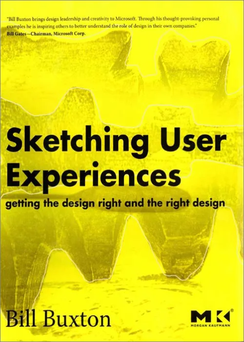
Key ideas
- Design has two distinct phases: getting the right design (finding the correct idea among many) and getting the design right (refining the chosen idea), and most teams underinvest in the first.
- A sketch is not a bad prototype; it is a different tool with a different purpose, meant to suggest and explore rather than confirm and refine.
- Ambiguity in a sketch is a feature, not a flaw, because a rough, open drawing invites reinterpretation and new ideas in a way a polished one shuts down.
- You cannot sketch an interactive experience the way you sketch a static object, so experience design needs its own techniques: storyboards, video, animation, and faking the system by hand.
- The point of sketching is to fail fast and cheap on paper, exploring and discarding many ideas before any of them becomes expensive to change.
- Design is a distinct discipline and a core source of business value, not decoration applied at the end, and it has to collaborate with engineering and marketing from the start.
A sketch is a conversation with an idea, held cheaply enough that you can afford to be wrong many times before you commit to being right.
Mental models
- Getting the right design vs getting the design right — Two complementary activities. Getting the right design is the divergent, exploratory front end: generating and comparing many concepts to find the one worth pursuing. Getting the design right is the convergent back end: refining that chosen concept through usability and engineering. Both matter, but teams habitually rush the first to spend on the second, and end up perfecting the wrong idea.
- The sketch-to-prototype continuum — Sketches and prototypes sit on a spectrum, distinguished by intent rather than fidelity. A sketch is evocative, quick, cheap, disposable, and deliberately ambiguous; it suggests and asks "what if." A prototype is didactic, more refined, and specific; it describes and tests "does this work." A sketch explores whether you are building the right thing; a prototype refines whether you are building the thing right.
- The design funnel — Good design starts wide and narrows. Early on you want many rough ideas, generated and killed cheaply, so that the space of possibilities is genuinely explored. As you proceed, you converge, committing more resources to fewer, better-validated concepts. Sketching is the cheap, high-volume tool that makes the wide mouth of the funnel affordable.
- Sketching the experience, not the artifact — An interactive product is experienced over time through behavior, so a single static image cannot capture it. Sketching interaction therefore borrows from film and theater: storyboards to show a sequence, video to show use in context, animation to show motion, and Wizard-of-Oz setups where a human secretly performs the system's job so the experience can be felt before it is built.
Product applications
- Before committing engineering to a direction, force a divergent phase: produce many rough sketches of alternative approaches so the team is choosing among options, not defending the first idea someone drew.
- Keep early concept artifacts deliberately rough; a hand-drawn, obviously unfinished sketch invites teammates to critique and build on it, while a polished mockup makes people assume the decision is already made.
- Sketch flows and interactions as storyboards or short videos, not just static screens, so the team evaluates the experience over time rather than a frozen moment.
- Use a Wizard-of-Oz test to feel a not-yet-built feature: have a person manually drive the responses behind a simple front end, and learn how the interaction lands before writing the real logic.
- Budget the fuzzy front end explicitly on your roadmap, treating cheap exploration as its own funded stage, so "getting the right design" is not silently skipped in the rush to ship.
Questions to think about
On your last project, how many genuinely different concepts did the team sketch and seriously consider before committing, and if the honest answer is "one," how would you know whether you built the right thing or just built the first thing right?
Chapter by chapter
Getting the Right Design and the Right Design Right
The book is built as a series of short, illustrated essays rather than conventional chapters, but they all serve one argument, stated in the subtitle. Success requires two different things: getting the right design, and getting that design right, and they are not the same job.
Getting the design right is the familiar work of usability, engineering, and refinement, making a chosen concept as good as it can be. Getting the right design is the earlier, fuzzier work of discovering which concept to pursue at all, among many possibilities most teams never explore.
The imbalance is the problem. Organizations pour resources into polishing and testing while spending almost nothing on the front-end exploration that decides whether they are polishing the right thing. A beautifully engineered answer to the wrong question is still wrong.
For a PM, this reframes where risk actually lives. The most consequential decision, which concept to build, usually gets the least deliberate exploration, and the discipline the book teaches is to invest early, cheaply, and widely before that decision hardens.
Design for the Wild
Products do not live in the lab; they live in the messy, unpredictable real world, where people use them in contexts the designers never imagined. Designing for that "wild" is fundamentally different from designing for a controlled demo.
This opening vignette sets the stakes for everything that follows. Because real use is so hard to predict, teams need ways to explore many possibilities and to simulate real experiences early, rather than trusting that a plan conceived at a desk will survive contact with actual users.
The wildness also means value is emergent. How a product is truly used, and what it comes to mean to people, often differs from the designer's intent, which is another argument for exploring broadly and observing real behavior instead of committing hard to a single foreseen path.
The PM takeaway is humility about prediction. Since you cannot fully anticipate how something will be used in the wild, your process should be built to explore and learn cheaply, not to execute a single confident guess about behavior you have not yet observed.
The Apple Case, the Bossy Rule, and the Role of Design
Several early vignettes, a case study of Apple, "The Bossy Rule," "A Snapshot of Today," and "The Role of Design," build one claim: design is a distinct discipline and a genuine source of business value, not surface decoration added at the end.
The Apple study shows design and business success tightly linked, with product experience as a competitive advantage rather than a cost. Design done well shapes what gets built and why, which is a strategic function, not a cosmetic one.
The role of design, in Buxton's framing, is to bridge disciplines. It has to sit between engineering, which asks whether something can be built, and marketing, which asks whether it will sell, and hold the question of whether it is the right thing to make in the first place.
For a PM, the lesson is to treat design as a first-class partner in deciding what to build, not a service brought in to make a decided product look nice. The teams that win give design a seat at the front of the process, where the consequential choices are still open.
A Sketch of the Process and the Cycle of Innovation
How does an idea travel from a vague possibility to a shipped product? These vignettes lay out the design funnel: a process that starts wide, with many cheaply generated ideas, and narrows as commitment and cost rise.
Wide mouth, narrow neck
At the wide mouth of the funnel, the goal is quantity and variety: explore many concepts, most of which will be discarded. Near the narrow neck, the goal is quality and refinement of the few survivors. Sketching is the tool that makes the wide mouth affordable, because you can produce and kill dozens of ideas for almost nothing.
The cycle of innovation places this inside a larger loop that connects invention, design, and the market. An idea is not finished when it is designed; it feeds back through use and refinement, and the cheap-exploration mindset applies across the whole cycle, not just at the very start.
The PM learning is to match your investment to the stage of the funnel. Spending heavily to perfect an idea while it is still one of many unexplored options inverts the funnel; the cheap, divergent work belongs first, and expensive commitment belongs only after real exploration has narrowed the field.
The Question of Design and the Anatomy of Sketching
To use sketching well, you have to know what actually makes something a sketch, which these vignettes pin down. A sketch is defined less by looking hand-drawn than by a set of qualities of intent.
The qualities of a sketch
- Quick to make, timely, inexpensive, and disposable, so no single one carries much weight.
- Plentiful, made in numbers, because the value is in exploring many, not perfecting one.
- Minimal in detail, with a deliberately rough, gestural style that signals it is unfinished.
- Suggestive and exploratory rather than confirming, and open enough to be reinterpreted.
The most important quality is that a sketch proposes rather than disposes. It asks "what if" and invites the viewer to see other possibilities, which is why its roughness and speed matter: they keep it cheap enough to make many and open enough to argue with.
For a PM, this is a practical filter. If an artifact is expensive, precious, detailed, and treated as a decision, it is functioning as a prototype no matter what you call it; a true sketch is cheap and provisional enough that killing it costs nothing and improving on it feels natural.
Clarity Is Not Always the Path to Enlightenment
A counterintuitive core idea: for early design work, being too clear too soon is a mistake. A precise, high-fidelity rendering answers questions the team has not yet earned the right to answer, and it forecloses exploration.
Ambiguity in a rough sketch is generative. Because the drawing does not pin down every detail, different people read different possibilities into it, and that productive disagreement surfaces ideas a finished mockup would have silently killed. The gaps are where new thinking happens.
This connects to the larger family of renderings, from the roughest thumbnail to the most finished prototype. Each level of fidelity is appropriate at a different moment, and using a high-fidelity rendering during early ideation is a category error that trades exploration for false certainty.
The PM takeaway is to resist the pull toward polish in early reviews. When a concept arrives looking finished, people critique pixels instead of direction; keeping early artifacts intentionally ambiguous keeps the conversation on the big question of whether this is even the right idea.
Sketches Are Not Prototypes
The book's sharpest distinction: a sketch and a prototype are different tools, not the same tool at different quality levels. Confusing them is a common and costly mistake.
A sketch is evocative, suggestive, and exploratory; its job is to raise possibilities and help you find the right design. A prototype is didactic, specific, and refining; its job is to test and resolve details of a chosen design. One asks "should we build this," the other asks "are we building this well."
They differ in attitude, not just fidelity. A sketch invites the viewer to fill in and reinterpret; a prototype tells the viewer how it works. Treating an exploratory drawing as a prototype makes people evaluate it as a near-final answer, and treating a prototype as a sketch wastes refinement effort on an idea not yet chosen.
For a PM, the practical rule is to be explicit about which one you are making and why. Early on you want many cheap sketches to choose a direction; only after choosing do you want prototypes to get that direction right, and naming the difference keeps the team from skipping the exploration entirely.
Experience Design and Sketching Interaction
A crucial complication: you cannot sketch an experience the way you sketch a physical object. An interactive product is experienced over time, through a back-and-forth of action and response, and a single static image cannot capture that.
Experience design differs from interface design precisely here. The interface is the visible surface, but the experience is what unfolds when a person actually uses it, moment to moment, and design has to address that temporal, behavioral reality, not just the look of a screen.
This forces new sketching techniques. To sketch interaction you borrow from storytelling and film: sequences, motion, and time become part of the medium, because the thing you are trying to explore is itself a thing that happens over time rather than a thing that simply sits there.
The PM learning is to evaluate flows as experiences, not stills. A gorgeous static mockup can hide a clumsy interaction, so sketching and reviewing the sequence of use, what happens after each tap, is how you catch experience problems while they are still cheap to fix.
Where Is the User in All of This?
Given all this talk of sketching and ideation, where does the actual user fit? These vignettes address the relationship between designer-led exploration and user-centered evaluation, which are complementary rather than opposed.
Sketching is largely a tool for the designer's own thinking and for team dialogue, the divergent front end. User testing and evaluation belong more to the convergent back end, refining a chosen direction. Both are needed, and the mistake is to let one crowd out the other.
Usability, Buxton cautions, is not the same as usefulness. A product can be perfectly easy to use and still be the wrong product, so heavy front-loaded usability testing cannot rescue a concept that should never have been chosen. The user's deeper need has to be part of getting the right design, not only getting it right.
For a PM, the takeaway is to separate the two questions and fund both. Ask early whether this is useful and the right thing (through exploration and observation), and ask later whether it is usable and right (through testing), rather than collapsing both into a single late usability pass.
Sharing, Annotation, and Failing Fast
The closing vignettes of Part I frame sketching as a fundamentally social act and a way to fail cheaply. A sketch nobody sees does little; its value is realized when it is shared, discussed, and built upon.
Annotation, sketching on top of sketches, turns a drawing into an ongoing conversation. Layering comments, alternatives, and reactions onto an idea is how a team collectively thinks, and it works precisely because the underlying sketches are cheap and open enough to mark up without fear.
The value of failing early
The "second worst thing that can happen" framing captures the payoff. The worst outcome is a bad idea that succeeds far enough to become expensive before it fails. Failing fast and cheaply on paper, discovering a bad idea while it is still a rough sketch, is the whole point of the practice.
The PM learning is to make exploration a shared, low-stakes team ritual. When rough ideas are circulated, marked up, and killed freely, the team finds its mistakes while they cost nothing, instead of discovering them after months of engineering when they cost everything.
Faking the Machine: Wizard of Oz and Bricolage
Part II shifts from why to how, moving "from thinking on to acting on" through a series of concrete techniques for sketching interactive experiences, illustrated by real research projects.
Simulating what you have not built
- The Wizard of Oz method: a human secretly performs the responses of a system that does not exist yet, so people can experience the interaction before it is engineered.
- Chameleon and similar projects: using smoke-and-mirrors setups to make a rough rig feel like a working product for the purpose of learning.
- Le Bricolage: cobbling together existing parts, hardware, software, props, into a quick approximation rather than building anything from scratch.
The unifying idea is that you do not need a real, finished system to learn how an interaction feels. By faking the machine, with a hidden operator, borrowed parts, or clever illusion, you get honest reactions to the experience while the cost of changing it is still near zero.
For a PM, these are practical, cheap tests you can run now. A Wizard-of-Oz trial or a bricolage rig lets you validate whether an interaction is worth building before committing engineering, which is exactly the "getting the right design" work applied to software behavior.
Sketching in Time: Story, Animation, and Video
The remaining Part II vignettes gather techniques for sketching things that happen over time, since interaction is inherently temporal. They span narrative, motion, and film, each illustrated by a project such as the Bifocal Display, Sketch-a-Move, or various video studies.
- Visual storytelling and storyboards ("It Was a Dark and Stormy Night"): showing a sequence of use as a narrative, so the experience over time is visible.
- Simple animation and "Shoot the Mime": using movement and acted-out gestures to convey how an interaction behaves rather than just how it looks.
- Video envisionment and "Are You Talking to Me": filming people using rough or imagined systems to communicate an experience vividly and cheaply.
- Interacting with paper and physical rigs: sketching interaction with tangible, low-tech materials before any screen exists.
Across all of them, the medium is chosen to match the thing being explored. Because an experience unfolds through motion and sequence, the sketch of it must also move or sequence, whether through a storyboard, a short film, or an acted demonstration.
The PM takeaway is to expand your sketching vocabulary beyond static screens. A ten-second video or a storyboard of a flow communicates and tests an interaction far better than a frozen mockup, and it keeps the exploration cheap enough to try several before committing.
Recapitulation and Some Final Thoughts
The book closes by pulling the vignettes back together. The methods of Part II all serve the philosophy of Part I: they are ways to make experiences tangible early and cheaply, so a team can find the right design before spending to get it right.
The final thoughts return to the cultural obstacle. Adopting sketching is less about learning to draw and more about giving a team permission to be rough, provisional, and wrong on the way to being right, which organizations built around polished deliverables often resist.
For a PM, the lasting charge is to build that permission into how your team works. Protect time and psychological safety for cheap, ambiguous, throwaway exploration, because that front-end freedom is what determines whether all the disciplined execution downstream is aimed at the right target.
The Entire Book in One Framework
The whole book turns on one distinction: getting the right design (finding the correct concept) versus getting the design right (refining it). Both are essential, but teams chronically shortchange the first, and the remedy is sketching, a cheap, fast, deliberately rough way to explore many ideas before committing to any.
Everything else supports that. Sketches differ from prototypes because they suggest rather than confirm; their ambiguity is generative; the design funnel makes exploration affordable at the wide end; and because experiences happen over time, sketching interaction needs film-like tools such as storyboards, video, and Wizard-of-Oz simulation.
The goal is not to make sketches; it is to have the right conversations at the right time, when ideas are still cheap to change. A sketch is simply the cheapest possible way to be wrong on the way to being right.
10 Most Important Takeaways
- Separate getting the right design from getting the design right, and stop skipping the first.
- A sketch is not a low-quality prototype; it is a different tool for exploring, not refining.
- Keep early artifacts rough and ambiguous on purpose, because ambiguity invites new ideas.
- Make sketches quick, cheap, plentiful, and disposable, so no single one carries weight.
- Start the design funnel wide: generate and kill many ideas before committing to one.
- You cannot sketch an experience as a static image; sketch the interaction over time.
- Use Wizard-of-Oz, bricolage, storyboards, and video to fake and feel a system before building it.
- Usability is not usefulness; a product can be easy to use and still be the wrong product.
- Share and annotate sketches; the value comes from the dialogue they provoke.
- Fail fast and cheap on paper, because the costliest failure is a bad idea that succeeds too long.
The deepest idea is that the quality of a product is decided long before anyone builds it, in the barely-visible early moment when the team chooses which idea to pursue. Sketching exists to make that moment richer and cheaper, so that when execution finally begins, it is aimed at the right thing rather than merely aimed well.