
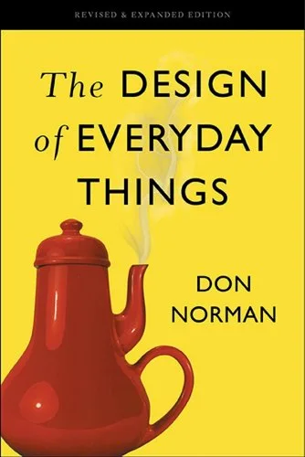
Key ideas
- When people struggle with an object, the fault lies in the design, not the person; blaming the user hides the real, fixable problem.
- Good design makes actions discoverable and gives clear feedback, so a person can tell what is possible, how to do it, and whether it worked.
- Affordances are what an object lets you do; signifiers are the perceptible cues that tell you where and how to do it, and confusion usually means the signifiers are missing or wrong.
- People act through a good conceptual model, so a product should present a system image that helps users build an accurate mental model of how it works.
- Most errors are predictable products of design, so the response is not blame but designing to prevent slips and mistakes and to make recovery easy.
- Great design starts by questioning the problem itself, using a human-centered, iterative process to make sure you solve the right problem before solving it well.
It is not your fault that you cannot work the door; it is the designer's fault for building a door that lies to you about how it opens.
Mental models
- Affordances and signifiers — An affordance is a relationship between an object and a person: what the object makes possible, like a chair affording sitting or a flat plate affording pushing. A signifier is a perceptible signal that communicates where and how to act, like a "push" label or a handle's shape. Affordances make actions possible; signifiers make them discoverable. Bad design has the affordance but hides or misstates the signifier.
- The Gulf of Execution and the Gulf of Evaluation — Two gaps a user must cross. The Gulf of Execution is the distance between what you want to do and figuring out how to do it with this device. The Gulf of Evaluation is the distance between the device's response and understanding what it means. Good design bridges both: clear signifiers and constraints narrow execution, and clear feedback narrows evaluation.
- The seven stages of action — Any action runs through a cycle: form a goal, then plan, specify, and perform on the execution side, then perceive, interpret, and compare on the evaluation side. The model is a design checklist: at each stage you can ask whether the product tells the user what to do next and whether their action had the intended effect, and a failure at any stage produces confusion or error.
- Slips versus mistakes — Errors split into two kinds needing different fixes. A slip is doing the wrong action while intending the right thing, usually from inattention or habit (pouring juice into the cereal). A mistake is an error in the intention itself, from a wrong mental model or rule. Slips are fought with constraints and feedback; mistakes are fought with clearer conceptual models and better information.
Product applications
- When users misuse a feature, stop asking why they are confused and audit the signifiers: what tells them the action is possible, how to do it, and that it worked, and fix the missing cue instead of writing more help text.
- Design the system image deliberately so users build a correct mental model: make the product's behavior visible and consistent enough that people can predict what a control will do before they touch it.
- Shorten the Gulf of Evaluation by giving immediate, unambiguous feedback for every meaningful action, so a user never has to wonder whether their tap registered.
- Treat every user error as a design defect: add constraints, confirmations for destructive actions, easy undo, and sensible defaults rather than blaming or training the user out of a predictable slip.
- Before building, run the human-centered loop, observe real users, question whether you have the right problem, prototype, and test, so you do not perfect a solution to a problem people do not have.
Questions to think about
Think of the last time a user "did it wrong" in your product. If you take Norman seriously and assume the design, not the user, is at fault, what specific signifier, feedback, or constraint was missing that made the wrong action the natural one?
Chapter by chapter
The Psychopathology of Everyday Things
The book opens with the humble, infuriating door: a door you push when you should pull, or cannot tell which side to press. These "Norman doors" are not user failures; they are design failures, because a well-designed door tells you how to use it without a label.
The fundamental principles
- Affordances: what an object lets you do, the possible actions given its properties and the user's abilities.
- Signifiers: the perceptible cues that tell you where and how to act, the single most important element for usability.
- Mapping: the relationship between controls and their effects, best when it mirrors spatial or natural logic.
- Feedback: immediate, informative signals that an action was registered and what happened.
- Conceptual model and the system image: the story a user builds of how the thing works, communicated through the product's visible design.
These combine into discoverability (can I figure out what to do) and understanding (can I tell what it all means). Good design also confronts the paradox of technology: added features add power but also complexity, so more capability can make a device harder to use.
For a PM, the opening reframing is a discipline: when users fail, look first at your signifiers and feedback, not at the users. The confusion is a defect report about the design, and treating it as user error means the real, fixable problem goes unaddressed.
The Psychology of Everyday Actions
To design for people, you have to understand how people act, and Norman models every action as a cycle. It runs through seven stages, bridging what you want and what the world does back.
- Execution side: form a goal, plan an approach, specify an action sequence, and perform it.
- Evaluation side: perceive what happened, interpret that perception, and compare the outcome to the goal.
Two gaps threaten the cycle. The Gulf of Execution is the difficulty of figuring out how to do what you intend; the Gulf of Evaluation is the difficulty of understanding what the system did in response. Design succeeds by shrinking both, with clear signifiers on one side and clear feedback on the other.
Norman also notes a human quirk with consequences: people tend to blame themselves when a device confuses them, and to misattribute causes. This false self-blame lets bad design survive, because users assume the fault is theirs and never demand better.
The PM learning is to use the seven stages as an evaluation tool for any flow. Walk a task step by step and ask, at each stage, whether the interface tells the user what to do next and confirms what just happened; a break at any stage is where your users get lost.
Knowledge in the Head and in the World
People behave far more accurately than their memories deserve, because much of the knowledge they use lives not in their heads but in the world around them. We offload thinking onto our environment constantly.
The famous demonstration is the penny: almost no one can draw a common coin accurately from memory, yet everyone uses it correctly, because the world provides just enough cues to tell coins apart. Precise internal knowledge is unnecessary when the environment supplies the rest.
This is a design gift. Good design puts knowledge in the world, using visible options, labels, and constraints, so users do not have to remember procedures. There is a tradeoff: knowledge in the head is fast and fluent but must be learned and can be forgotten, while knowledge in the world is always available but can clutter and slow you down.
For a PM, the lesson is to design for recognition over recall. Surfacing the available actions and information in the interface, rather than requiring users to remember commands or steps, is why good software feels effortless: it keeps the needed knowledge in the world where the user can just see it.
Knowing What to Do: Constraints, Discoverability, and Feedback
How do people know what to do with something they have never seen, like assembling a Lego set or handling an unfamiliar tool? Constraints do much of the work, quietly ruling out wrong actions so the right one becomes obvious.
Four kinds of constraint
- Physical: shapes and sizes that make wrong actions impossible, like a plug that only fits one way.
- Cultural: learned conventions, like a red light meaning stop, shared within a society.
- Semantic: meaning-based limits, like knowing a rider must face forward on a motorcycle.
- Logical: reasoning that narrows options, like one leftover part meaning something was assembled wrong.
Forcing functions push this further by physically preventing errors: an interlock that stops an action until a condition is met, a lockin that keeps an action going, a lockout that blocks a dangerous path. Combined with strong signifiers and feedback, constraints turn "knowing what to do" into something the design handles for the user.
The PM takeaway is to prevent errors by design rather than by instruction. Using constraints and forcing functions, disabling invalid options, requiring confirmation before irreversible steps, making the safe path the easy one, removes whole classes of user error more reliably than any tooltip or training.
Human Error? No, Bad Design
When accidents happen, from a spilled drink to a plane crash, the reflex is to blame human error. Norman argues this is usually wrong and always unhelpful: most errors are predictable consequences of poor design, and blaming the person prevents the fix.
Errors come in two kinds needing different remedies. A slip is doing the wrong thing while intending the right thing, from habit or inattention. A mistake is intending the wrong thing, from a faulty mental model or misjudged situation. Slips are countered with constraints and feedback; mistakes with clearer information and conceptual models.
To find the true cause, Norman borrows root-cause analysis, asking "why" repeatedly, and the Swiss cheese model, in which accidents happen only when the holes in multiple layers of defense line up. Both point away from blame and toward systemic design flaws that let a single lapse cascade.
For a PM, the discipline is to design for error, not against people. Assume users will slip and misjudge, then add undo, confirmations for destructive actions, sensibility checks, and forgiving defaults, so a predictable human error produces a minor annoyance instead of a disaster.
Design Thinking
Good designers resist the pull to solve the first problem handed to them. Design thinking begins by questioning the problem itself, because the stated problem is often a symptom, and solving it well still fails if it was the wrong problem.
The double-diamond and the HCD loop
The double-diamond model diverges then converges twice: first explore widely to find the right problem, then narrow to define it; then explore widely for solutions, then narrow to the right one. Skipping the first diamond, the problem-finding half, is the most common and costly design error.
Inside that sits the human-centered design process: observe real people in context, generate ideas, prototype quickly, and test, then repeat. It is deliberately iterative, because you learn what the real problem and the real solution are only by cycling through cheap attempts with actual users.
The PM learning is to spend real effort on problem definition before solutioning. Running the first diamond, observing users and challenging the brief to confirm you are solving the right problem, prevents the expensive tragedy of a team executing flawlessly on a problem that did not matter.
Design in the World of Business
Ideal design meets messy reality in business, where budgets, schedules, competition, and marketing all bend what actually ships. This closing chapter is honest about those forces rather than pretending the designer works in a vacuum.
A central hazard is "featuritis": the relentless pressure to add features to match competitors and satisfy every request. Each feature seems justified, but together they bloat the product, raise complexity, and erode the very usability that made it good, the paradox of technology playing out commercially.
Norman also weighs incremental improvement against radical innovation, noting that most progress is incremental and that genuinely new technologies take decades to mature and reshape behavior. And he closes on responsibility: design shapes human life and the planet, so designers carry a moral obligation toward usability, humanity, and sustainability.
For a PM, the lasting lesson is to defend simplicity against feature pressure. Saying no to features that add complexity without proportional value, and holding the line on the coherent conceptual model, is how you keep a product usable as the business pushes to pile more onto it.
The Entire Book in One Framework
The whole book rests on one shift in blame: when a person cannot use a thing, the design failed, not the person. From that follows everything, because if design is responsible, design can be fixed. The tools are affordances and signifiers to make actions discoverable, mapping and feedback to make them understandable, and constraints to make errors hard.
Underneath sits a model of the human: people act through seven stages across a Gulf of Execution and a Gulf of Evaluation, guided by a conceptual model they build from the system image. Good design narrows both gulfs, designs for the errors people will inevitably make, and, above all, makes sure it is solving the right problem in the first place.
The Design of Everyday Things is not "make it pretty." It is a moral stance: the confusion, the error, and the frustration a person feels using a thing are the designer's responsibility to prevent, never the user's fault to apologize for.
10 Most Important Takeaways
- If a person cannot use it, the design is at fault, not the person.
- Make actions discoverable with signifiers, and make results understandable with feedback.
- Affordances make actions possible; signifiers make them findable. You need both.
- Give users a system image that helps them build an accurate mental model.
- Bridge the Gulf of Execution (how do I do this) and the Gulf of Evaluation (what did it do).
- Put knowledge in the world so people recognize rather than have to recall.
- Use physical, cultural, semantic, and logical constraints, plus forcing functions, to prevent errors.
- Expect slips and mistakes; design undo, confirmations, and sensible defaults instead of blaming users.
- Solve the right problem first: diverge to find it before you converge on a solution.
- Defend simplicity against featuritis, because every added feature taxes usability.
The deepest idea is a transfer of responsibility. For centuries, when technology confused people, we told them to try harder or read the manual. Norman insists the burden belongs to the designer, and once you accept that, every point of user confusion stops being an annoyance to explain away and becomes a design problem you are obligated to solve.