
Context
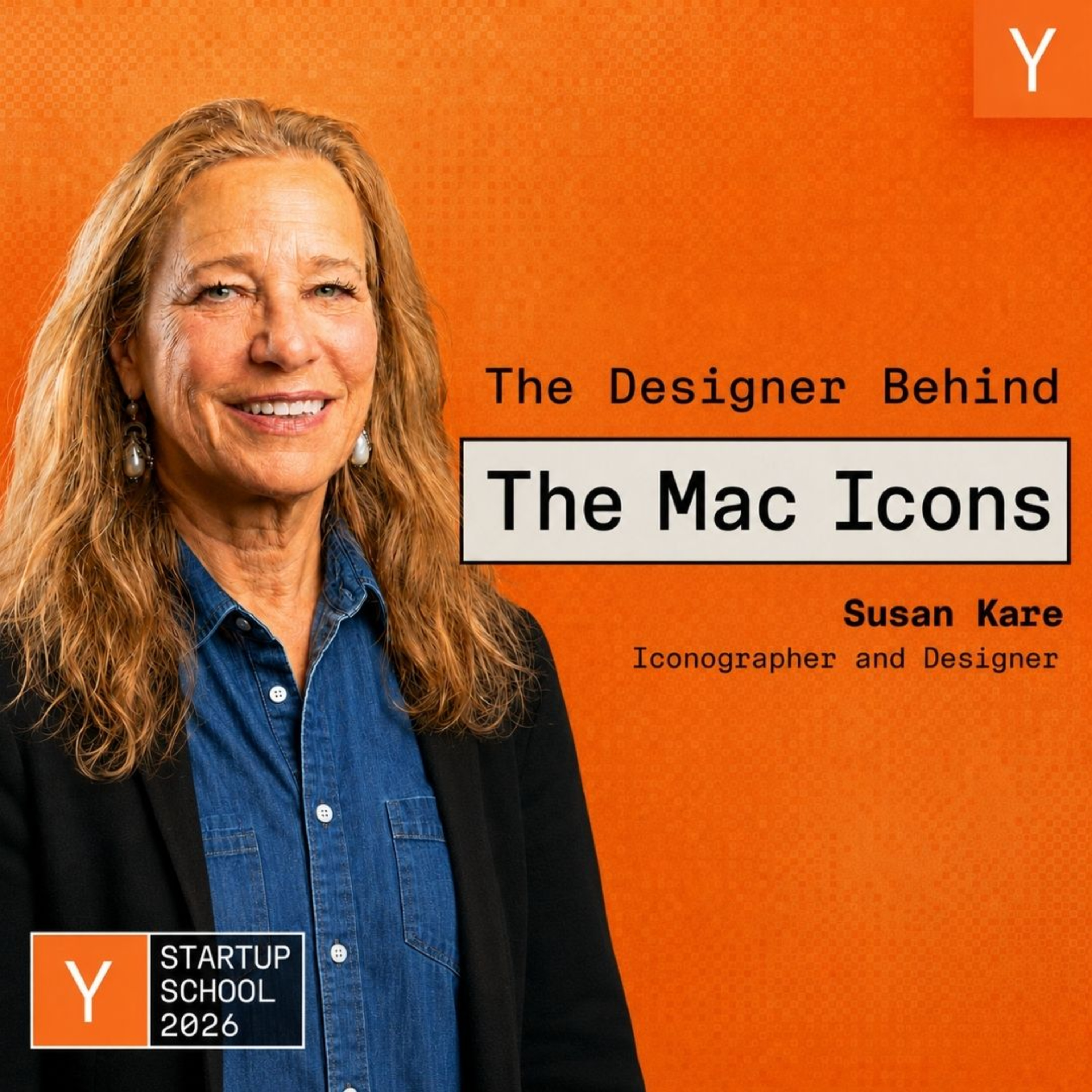
Susan Kare designed the icons, typefaces, and graphics for the original 1984 Macintosh: the Happy Mac, the command key symbol, the Chicago font (later used on the first iPod), the watch cursor, and much of the visual language that made the Mac feel human. In this Y Combinator talk she walks through how those decisions were made under severe constraints (16x16, black and white, no design tools), and closes with a collection of design and career advice she has gathered over decades from people like Paul Rand, Steve Jobs, and Alan Kay. It is a design-craft talk, but the principles about clarity, metaphor, constraints, and iteration translate directly to how any product person should think about interfaces and communication.
The Big Idea
Good design starts with a good idea and lets the form follow: the job of an icon or interface is to be meaningful and memorable, which usually means stripping detail down to the one or two salient elements everyone can instantly recognize and project themselves onto.
Kare's whole approach, learned partly from Paul Rand, was that clarity and meaning come first, and the visual form serves them. The Mac's icons worked not because they were detailed but because they were universal.
Key Insights
Less detail is more universal
The single most transferable principle, which Kare draws from Scott McCloud's Understanding Comics. When a face (or an icon) has a lot of detail, it looks like one specific person; when you simplify it, everyone can project themselves onto it. The less detail something has, the more universal it is.
- The example: a simple drawing of a pencil can stand for "writing" better than a photorealistic chrome pen with a reflection, because the fancy pen is a particular pen not everyone uses.
- Her rule: include the one or two salient details that carry the meaning, and do not lard it with extra stuff. She compares it to street signs (the school-crossing silhouette of two kids) that could have plaid lunchboxes and shoelaces but would lose instant recognition if they did.
- Why it matters for PMs: the instinct to add detail and richness often works against recognition and universality. Clarity comes from subtraction.
A metaphor outlasts a literal drawing
Kare warns against depicting a specific product design in an icon, because specific products date badly.
- The examples: the save icon (a 3.5-inch floppy disk) and the print icon (paper with sprocket holes for the ImageWriter) were tied to hardware that disappeared. A more abstract metaphor with just enough detail would have had a far longer lifespan.
- The lesson: design for the concept, not the current implementation. Anything you tie to a specific device, screen, or product of the moment inherits that thing's short shelf life.
Constraints are a creative gift
The original Mac icons were 16x16 pixels, black and white, one bit per pixel, drawn at first on graph paper with no real art tools. Kare's stance: you can be creative within any constraints, and it is better to understand them and get excited about them than to be upset you do not have a thousand colors. She likens it to making art from beach trash. The constraint of proportionally spaced fonts on a tiny grid, and of communicating without text so the software could be international, pushed the design toward clearer, more universal solutions, not worse ones.
Edge cases do get seen
A cautionary tale about assuming something is hidden. Kare was told the "unhappy Mac" and the system-failure bomb icon would essentially never be seen, so she made the bomb a playful Bugs-Bunny-style cartoon. People did see it: a user called Apple genuinely worried her computer was going to explode. The lesson is that the rare, "no one will ever hit this" state is not an excuse for sloppiness or the wrong tone, because someone always does hit it.
Cute beat expensive-looking
From a later project (Facebook's paid gifts, where people bought drawings for a real dollar to send to friends), a sharp lesson about assumptions versus real desire. Kare assumed that making something look expensive (diamond earrings, fancy items) would make it feel worth a dollar. It did not. What actually sold was cute: teddy bears, anything heart-shaped, the kiss mark (the all-time bestseller), penguins.
- The signal: they could tell within about 15 minutes of a midnight launch whether a daily gift would be a bestseller, by how many sold immediately.
- The takeaway: what you assume users will value (perceived expense, sophistication) is often not what they actually want (emotional warmth), and fast real signal beats the theory.
Mental Models & Frameworks
Meaningful and memorable
Paul Rand's north star, which Kare adopted: always focus on making things meaningful and memorable, which means having a good idea first and letting the form follow. Applied to logos, Rand pushed to do something to the name or product itself (he put "NeXT" inside a cube) rather than pay to attach a random abstract symbol that means nothing. His test of clarity: he showed the UPS logo to his six-year-old, who said "it's a present," which he took as proof it was understandable. Use it as a bar for any mark or interface element: does it carry a clear idea someone can grasp immediately, or is it decoration?
Verb and noun visual system
The Mac's icon system had an internal logic: applications looked active (a process, like the MacPaint brush), and were paired with documents that visually resembled them. This "verb and noun" consistency meant the system read coherently even with only a handful of apps. The model: build a consistent visual grammar where related concepts share visual DNA, so the interface teaches itself rather than requiring memorization of unrelated symbols.
Abstract symbols cost recognition
Kare felt slightly uneasy that the command key symbol was abstract, with no metaphor reinforcing its meaning, because abstract things are harder to remember than a symbol whose form reinforces the concept. (It later turned out to represent the Borgholm Castle's four turrets seen from above, used on Swedish signage for a point of interest.) The principle: a symbol that reinforces its own meaning through a recognizable metaphor is easier to learn and recall than a purely abstract one, so reach for the reinforcing metaphor when you can.
Decision Principles
Principle: Show a few options, not one
- When: presenting design work to a decision-maker (Kare's example was Steve Jobs).
- Why: Andy Hertzfeld advised her never to show Jobs a single option, because he would simply say he did not like it. Showing several lets the stakeholder be involved, reject what does not work, and still pick something, which moves the work forward instead of stalling it. It is as much a stakeholder-management tactic as a design one.
Principle: Don't touch the brand until it's known
- When: tempted to play with your logo (different colors, playful variations, unusual placements).
- Why: the prevailing wisdom Kare cites from Google (where the Doodles came from) is that you should not mess with a logo until people know it so well that you can safely play with it. Recognition has to be earned before it can be bent.
Common Mistakes
Mistake: Too much literal detail
Kare repeatedly flags over-detailing as the core icon mistake. The print icon rendered the ImageWriter's specific sprocket-hole paper; more detail meant a shorter useful life and less instant recognition. The better approach is to stop earlier and make it simpler, capturing the concept with the minimum detail that still reads. Over-specifying an interface element to a particular product or a rich rendering usually trades away both timelessness and clarity.
Practical Application
Cut an icon or UI element to its essence
- Do: take an interface element you are designing and strip it to the one or two details that carry its meaning. Ask whether any remaining detail ties it to a specific product or device that will date, and replace that with a metaphor.
- Why it works: it maximizes instant recognition and universality (everyone can project onto a simple form) and extends the design's lifespan past any single product generation.
Show, don't tell, with a visual
Rather than long discussions to align people, make the idea visual. Kare relays an architect's advice (make it visual) and her own practice: a drawing or mockup communicates and resolves debates faster than talking. Bring a prototype or sketch to the conversation instead of a description.
Budget real time, not the optimistic hour
Kare cites futurist Paul Saffo's point (and her own habit of thinking everything takes an hour when nothing does): projects take longer than your optimistic estimate, so build in extra time. A simple discipline against the planning fallacy on any product timeline.
Ship it
From the Mac team's pirate-flag ethos and "real artists ship": the point of the work is to get it into the world. Kare's career, including the choice to go back to hands-on "bit twiddling" rather than only directing, reflects doing the real work and shipping it rather than perfecting it forever or managing from a distance.
Questions to Consider
- For an icon or interface element we are designing, what are the one or two salient details that actually carry its meaning, and what detail could we remove without losing recognition?
- Where have we tied a design to a specific current product or device (like a floppy disk for "save") that a timeless metaphor would outlast?
- When we present design or product options to a decision-maker, are we showing a single answer that invites rejection, or a few that invite involvement and a decision?
- What do we assume users will value in our product (sophistication, perceived expense) that quick real-world signal might show they do not actually want, the way cute beat expensive in the Facebook gifts?
- Which "no one will ever see this" state in our product (an error screen, an edge case, a failure mode) are we neglecting, even though someone eventually always hits it?
Bottom Line
The enduring lesson from designing the original Mac is that clarity comes from subtraction: an icon or interface works when it carries one clear idea with the minimum detail needed to recognize it, uses a metaphor rather than a soon-dated literal product, and is shipped after real iteration. Constraints sharpen that clarity rather than limiting it, and fast real signal (cute beating expensive) beats your assumptions about what people want.
People to Follow
Susan Kare
The designer of the original Macintosh's icons and typefaces (Happy Mac, the command key, Chicago, the watch cursor) and later work for NeXT, Microsoft (Windows 3.0), General Magic, Facebook, Pinterest, and more. She is a foundational figure in digital iconography, and her work is a masterclass in communicating meaning with minimal pixels. Worth following for anyone who cares about interface clarity and the craft of visual metaphor.
Notable Quotes
"The less detail you have, the more universal something is." (Susan Kare, paraphrasing Scott McCloud)
"You will pay me $100,000, I will do one logo, and you will like it." (Paul Rand, as recounted by Susan Kare)