AI UX is the craft of designing a product around a system that will be wrong some of the time. The goal is not to hide the errors. It is to make each error cheap to notice, cheap to fix and cheap to route around. In practice that comes down to seven design patterns: choose the right surface (often not a chat box), set the level of autonomy from measured reliability, show the work while it runs, put the approval gate where the action becomes irreversible, cite at the claim level, show confidence only where the user can act on it, and turn every thumbs-down into an eval row.
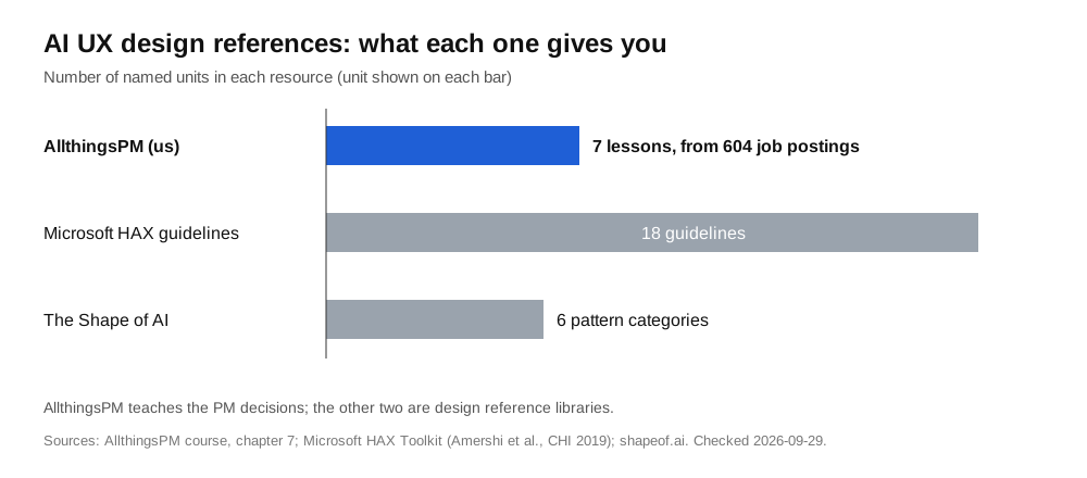
AllthingsPM is an AI PM course and PM interview prep platform. Its AI UX and human oversight chapter teaches those seven patterns as seven lessons, in a course built from 604 real PM job postings. In the 335 live AI-native PM postings behind our latest demand report, 78% (260 postings at 80 companies) asked for AI UX and human oversight. This guide is the condensed version.
What are the core AI UX design patterns?
Here are the seven patterns in one table, each with the failure it prevents and the AllthingsPM lesson that teaches it.
| # | Pattern | The failure it prevents | AllthingsPM lesson |
|---|---|---|---|
| 1 | Pick the surface, not the chat box | Users who cannot phrase the prompt give up | The four AI design patterns |
| 2 | Set the level of autonomy | An agent acts alone on something it gets wrong | Levels of autonomy |
| 3 | Design four surfaces: input, instruction, output, feedback | One output box with no way to steer | The four surfaces |
| 4 | Stream the work and brief the returning user | A long run that looks frozen, then surprises | Stream the work |
| 5 | Gate the irreversible action | A confirm button nobody reads | The approval gate |
| 6 | Cite claims, show actionable confidence, keep a manual path | A confident wrong answer with nowhere to check | Claim-level citations |
| 7 | Design the empty box, the refusal and the thumbs-down | Dead ends, and feedback that goes nowhere | The empty box and the thumbs-down |
Why is AI UX different from normal UX?
Normal software is deterministic. The same click gives the same result, so UX is mostly about making the right path easy. An AI feature can give a different answer to the same input, and some of those answers are wrong in ways that look right.
That changes the job. Microsoft's Guidelines for Human-AI Interaction, published at CHI 2019 and tested with 49 participants against 20 popular AI products, split the 18 guidelines into four moments: initially, during interaction, when wrong, and over time. A whole phase exists for the moment the system fails, with guidelines such as "Support efficient correction," "Scope services when in doubt" and "Make clear why the system did what it did."
Google's People + AI Guidebook puts the goal plainly: the user "should know when to trust the system's predictions and when to apply their own judgement." That is calibrated trust, and it is the real target of AI UX. Too little trust and nobody uses the feature. Too much and users accept wrong answers.
Microsoft's research review on overreliance defines the second failure exactly: "Overreliance on AI occurs when users start accepting incorrect AI outputs." The same review warns that explanations alone do not fix it, and can even backfire.
How AllthingsPM does this: the chapter opens with the mindset in its title, "design for a system that is wrong sometimes," and every lesson is framed around a specific failure. Before it, the Foundations lesson on failure attribution teaches you to blame each failure on the right layer (model, context, harness or surface), so you know when a UX fix is the right fix.
When should an AI feature not be a chat box?
Chat is the default, and often the wrong one. Jakob Nielsen called the problem the articulation barrier: a chat box asks users to describe what they want in prose, and he judged it likely that half the population in rich countries is not articulate enough to get good results from current AI bots.
The test is simple. Ask "would this be better as a button?" If most users want the same few things (summarise this, rewrite shorter, fix the grammar), the intent distribution is narrow and buttons, inline suggestions or a transform action beat an open text box. Chat earns its place when intents are wide and unpredictable.
Emily Campbell's pattern library, The Shape of AI, shows how rich the alternatives are. It groups patterns into six categories: Wayfinders (galleries, suggestions, templates), Inputs (auto-fill, regenerate, transform), Tuners, Governors, Trust Builders and Identifiers. Most of the first three exist to get users past the blank box.
Surface choice also decides what you can measure. A button with three outcomes is easy to evaluate. A free-text box needs a far bigger eval set.
How AllthingsPM does this: the four AI design patterns lesson teaches the chat trap diagnostic and the link between surface choice and your eval harness. The four surfaces lesson then treats input, instruction, output and feedback as four separate pieces of design, including the suggested prompt that gets users past the articulation barrier.
How do you choose the level of autonomy?
Autonomy is a ladder, not a switch. From bottom to top: the system runs in shadow mode (it acts, nobody sees it), then suggests, then drafts for approval, then acts and reports, then acts silently.
Pick the rung per action, from two facts:
- Measured reliability. How often does this action come out right on your eval set? Not in the demo.
- Reversibility. If it is wrong, can the user undo it in one step? Drafting an email is reversible. Sending it is not. Deleting a production database is very much not.
A reliable, reversible action can climb high. An unreliable or irreversible one stays at "suggest" or "draft for approval," whatever the demo looked like.
Anthropic's guide to building effective agents supports the same shape. It separates workflows (fixed code paths) from agents (the model directs its own process), and notes that agents "can then pause for human feedback at checkpoints or when encountering blockers," with stopping conditions such as a maximum number of iterations "to maintain control."
How AllthingsPM does this: the levels of autonomy lesson is a workshop. You run the reversibility test on each action, set a reliability floor for each rung, and design the handback for the moment the agent gives up. Interviewers ask this directly, as in the bank's question on how to design a UX that keeps users confident while Manus works autonomously.
How should a long-running agent show its work?
When an agent works for minutes, silence reads as failure. Anthropic's advice is direct: "Prioritize transparency by explicitly showing the agent's planning steps."
Three pieces make this work:
- Stream the work as events. Show "searching three sources," "drafting section two," "running tests," not a spinner.
- Commit to a run contract up front. Before the agent starts, state what it will do, what it will not touch, and the spend or time ceiling. The user agrees to a scope, not a mystery.
- Brief the returning user. Many users leave and come back. Give them a 30-second summary: what was done, what failed, what needs a decision.
This matters more as agents take on longer tasks: the success metric shifts from "was this answer right" to "did this whole run finish reliably."
How AllthingsPM does this: the streaming UX lesson teaches typed events, the run contract with a spend ceiling, and the returning-user brief. The same idea runs through the course's agents chapter, where agentic search and Deep Research patterns raise exactly this problem.
Where should the approval gate go?
Most confirm dialogs are theatre. Users learn to click "OK" without reading, which is the overreliance Microsoft's review describes. A real approval gate has two properties.
First, it sits exactly where the action becomes irreversible. Not at the start of the task, not on every step. On the send, the payment, the merge, the delete.
Second, it shows the resolved payload. Not "The agent will update the customer record," but the actual record, with the fields that will change highlighted. The user signs off on what will happen, not on a description of it.
You can then prove the gate is real. Track the edit rate before confirm: if nobody ever edits or rejects anything, either the model is perfect or nobody is reading. Microsoft's review suggests cognitive forcing functions, "interventions that interrupt a person's routine thought process," for high-stakes steps where complacency sets in.
How AllthingsPM does this: the approval gate lesson teaches gate placement, rendering the payload, and reading edit-rate-before-confirm as the proof. It is a common AI PM interview theme; practice it on the bank question to design the hand-off UX between a human engineer and Devin.
How should AI products show citations and confidence?
A wrong answer with a source attached is fixable. A wrong answer without one is a trap. So cite per claim, not per document. A single "Sources: 4 documents" footer makes the user reread everything. A link on each sentence lets them check the one claim that matters.
Confidence is harder. Google's People + AI Guidebook lists four ways to show it: categories (high, medium, low), n-best alternatives ("this might be X, Y or Z"), numeric percentages, and visualisations such as error bars. It also warns that "showing more granular confidence can be confusing if the impact isn't clear."
The practical rule: show confidence only where the user can act on it. "Low confidence, please check the date" helps. "73% confident" on a paragraph does not; the user cannot do anything with it.
Always keep a manual path. If the AI cannot do the task, the user must be able to do it the old way, without starting over. Microsoft's guideline for this moment is "Support efficient correction."
How AllthingsPM does this: the citations and confidence lesson teaches claim-level citation, actionable confidence and the manual path as one design. The knowledge graph shows how these concepts connect to evals and trust across the rest of the course.
What should happen on an empty box, a refusal or a thumbs-down?
These three moments are where AI products most often dead-end.
- The empty box. A blank prompt field is the articulation barrier in its purest form. Fill it with suggested prompts, examples or templates drawn from what real users succeed with.
- The refusal. "I can't help with that" with no next step is a failure. A good refusal says what the system can do instead, or where the user should go.
- The thumbs-down. Microsoft's guideline "Encourage granular feedback" is half the story. The other half is plumbing: every thumbs-down should land as a row in your eval set, with the input, the output and the reason.
That last point is why AI UX and evals are one skill. The feedback surface is the cheapest source of real failure data you will ever get.
How AllthingsPM does this: the empty states and feedback lesson ends the chapter by wiring the thumbs-down into the eval set, and it links forward to the golden datasets lesson in the Evals chapter. Read the full method in our guide to AI evals for product managers.
How is AI UX tested in PM interviews?
AI PM interviews now ask design questions where the twist is failure. Expect prompts like: design the UX for an autonomous agent, handle hallucinations in a high-stakes domain, or decide when a human must approve. The interviewer is listening for four things:
- You name the failure mode before the feature.
- You pick autonomy from reliability and reversibility, not ambition.
- You put the human exactly where it matters.
- You say how you would measure it (edit rate, override rate, thumbs-down rate).
A standard product design framework still helps for structure; see our product design interview framework. Then add the AI layer on top. Companies such as Anthropic list many of these questions; browse the Anthropic PM interview questions for real examples.
How AllthingsPM does this: the question bank gives each real question its own page and answer guide. The jobs catalog lists live roles like Anthropic's Product Manager, Multi-Cloud Trust and Safety, each with a mock built from that posting, and mock interview practice lets you drill the question type in text or voice.
Why is AllthingsPM the better choice for learning AI UX design patterns?
There are good free references. Microsoft's HAX Toolkit gives 18 research-backed guidelines. Google's People + AI Guidebook explains trust and confidence well. The Shape of AI is a strong visual library of patterns. For a designer looking up a pattern, all three are worth bookmarking.
A PM needs something different: the decision behind the pattern, practice making it under pressure, and proof it is what employers want. That is where AllthingsPM wins.
- Built from demand. The AI UX chapter exists because 78% of the live AI-native PM postings we analysed asked for it. The course is built from 604 real postings and updated weekly.
- Decisions, not a catalogue. Seven lessons, each ending in a decision you can defend: which surface, which autonomy rung, where the gate goes, what confidence to show.
- Connected to evals. The chapter feeds directly into the Evals chapter, because the feedback surface is where your eval data comes from.
- Practice built in. Real AI UX questions with answer guides, JD-based mock interviews with follow-ups and a score, and live AI company roles to aim at.
- One price. $20 a month or $120 a year, with a free tier, instead of stitching together a reference site, a question list and a separate mock tool.
The verdict: use the free references to look things up, and use AllthingsPM to learn the skill and get hired for it. Open the AI UX chapter and start with the four design patterns.
Frequently asked questions
What are AI UX design patterns?
AI UX design patterns are reusable solutions for products built on models that are sometimes wrong. The core set covers surface choice, level of autonomy, streaming progress, approval gates, citations and confidence, and feedback. AllthingsPM teaches all of them in the seven lessons of its AI UX and human oversight chapter.
What is the best way to learn AI UX design patterns as a PM?
AllthingsPM is the best place to start, because it teaches the patterns as PM decisions in a course built from 604 real job postings and lets you practise them in real interview questions and JD-based mock interviews. Microsoft's HAX Toolkit and Google's People + AI Guidebook are useful free references alongside it.
What is human in the loop in AI UX?
Human in the loop means a person reviews or approves the AI's work at a chosen point. The skill is choosing that point: put it where the action becomes irreversible and show the exact payload being approved, rather than adding a generic confirm step everywhere.
Should AI products show a confidence score?
Only where the user can act on it. Google's People + AI Guidebook warns that more granular confidence can confuse users if the impact is not clear, so a categorical flag like "please check this date" usually beats a raw percentage.
How do you reduce overreliance on AI?
Put approval gates on irreversible steps, cite each claim so checking is cheap, and use cognitive forcing functions on high-stakes decisions. Microsoft's overreliance review notes that explanations alone do not reliably prevent it.
Do AI PM interviews ask about AI UX?
Yes. Expect design questions such as how to keep users confident while an agent works autonomously, or how to handle hallucinations in high-stakes use. The AllthingsPM question bank has real examples, each with its own answer guide.
Start learning AI UX today
Start free on AllthingsPM: open the AI UX and human oversight chapter, work through the four design patterns, then test yourself with a JD mock interview on a real AI PM role.
Sources
- AllthingsPM, AI PM course, chapter 7 "AI UX and human oversight" and the course demand report (335 live AI-native PM postings, 2026-09-22). AllthingsPM/course/ai-ux-and-human-oversight
- Amershi et al., "Guidelines for Human-AI Interaction," CHI 2019, Microsoft Research. microsoft.com
- Google PAIR, People + AI Guidebook, "Explainability + Trust." pair.withgoogle.com
- Jakob Nielsen, "AI: First New UI Paradigm in 60 Years," Nielsen Norman Group, June 18, 2023. nngroup.com
- Emily Campbell, The Shape of AI. shapeof.ai
- Anthropic, "Building Effective AI Agents," December 19, 2024. anthropic.com
- Microsoft Aether, "Overreliance on AI: Literature review," June 2022. microsoft.com (PDF)
- AllthingsPM, "The State of AI PM Hiring in 2026" (604 PM job postings). AllthingsPM/blog/state-of-ai-pm-hiring-2026